Wednesday, July 22, 2015

Acclivity Chalk Mural 2 of 3: Welcome Board


Possibly the most daunting of the three boards was the Welcome board.  This puppy stands 8.5 feet tall by 12 feet wide and is the first thing one sees when entering the offices.  It serves as a welcome to guests as well as a directory pointing the way to important places (like the coffee station). 


So the pressure was on.  My initial thought was for the company name to read like the road signs one sees when entering a new town on the interstate.  I wanted just a hint of kitsch (perhaps the Vegas influence) and so created a cut-out-looking sun. I even toyed with the idea of putting legs on the sign and a population count - but as the other walls came together, the whole idea seemed too literal. So I kept it in the same marquee sign style - but the sun stayed.  


They had a few ideas for nerdy-in-the-good-way touches they wanted to add.  I was asked to include their spookily-named supply closet in the left-pointing directional and a treat for Lost fans appears in the lower right corner of the board.


I’m saving the best board for last - the upcoming Core Values design is not to be missed!

Thursday, July 16, 2015

Acclivity Chalk Mural 1 of 3: Product Development Calendar


Acclivity Software is, as their tagline states, “a small business making small business software”. A few months ago, I worked closely with Co-Founder Scott Davisson, fellow font snob enthusiast, to create three hand-lettered chalkboard murals for the walls of their headquarters. 

It’s obvious when visiting the offices that everyone is passionate about and proud of their work - which translates into an excited, fun environment that I wanted to pick up on and amplify with my boards. 

Because I draw so much of my inspiration from vintage branding and advertisements, my work can often turn out a little serious.  A friend and fellow designer once told me that the 2-ply letterpress business cards I designed for my handyman boyfriend made him seem less like your friendly neighborhood handyman and more like the handyman who will CHANGE YOUR LIFE.  (I think that’s supposed to be bad)  But I just like to keep my work from looking silly or juvenile and it can be difficult to capture whimsy without crossing the line.  

Stellabird Creative - Serious handyman business cards for serious handymen.

So the goal with the Acclivity boards was to play up the fun vibe, while still keeping with the vintage feel that I so love to draw from.  I decided to do so by bringing in elements of antique theatre marquees and circus signs. I used the clean sans-serif typestyle that they use for most of their branding to keep it looking modern, and popped it into dimensional-looking signage surrounded by little marquee bulbs.

Photo Credits: UL: Wikipedia; R: commons.wikimedia.org; LL: SchuminWeb

The first board I put up was pretty straightforward.  Their Product Development team uses their chalkboard to create fluid calendars for keeping track of each others’ vacations, etc.  I wanted to give them a more permanent framework for that and add a department title to the top.  


I’m so excited to share the other boards, as well, but they each deserve their own post.  Stay tuned!

Wednesday, July 1, 2015

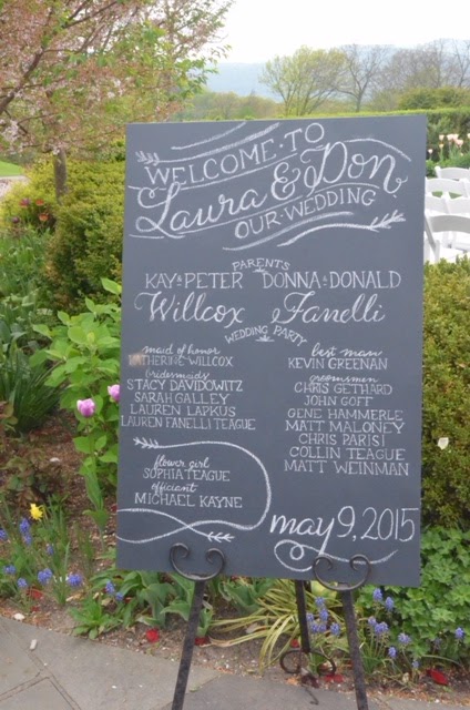
Laura and Don's Wedding Program Chalkboard


I’ve been working for almost nine years consulting on and designing custom wedding stationery suites.  Whether regarding invitations, place cards, or thank you notes, helping couples develop printed pieces that speak to them and their unique celebration is something I thoroughly enjoy. So I was so excited when I received a call about lettering a wedding program on a chalkboard.

Laura and Don were looking for a board that would list their parents’ names, along with those of the wedding party and other key ceremony players. The bride’s dad created a large, poster-sized board that would sit on an easel during their outdoor ceremony, and then transition indoors to stand outside the reception hall.

While developing a design, I asked to take a peek at Laura and Don’s wedding invitation.  Their fun, modern invitation included a chunky block lettering style, with their names popping in a fun, curved script design. I decided to give a nod to that element, as well as a floral sprig/branch graphic.  This would keep the feel of things consistent and also complement their charming outdoor venue.


This wedding party was somewhat unusual in that there were many more groomsmen than bridemaids, which would not lend itself very well to a symmetrical layout. I decided to balance it out by carving out a separate space for the flower girl within the list of bridesmaids.


They sent me this beautiful picture of the board displayed at the ceremony. Best wishes to the happy couple!


Saturday, June 20, 2015

Jean’s Spring Into Summer Party


“If you want to make God laugh, tell him about your plans.” - Woody Allen

The plan was perfect: guests would arrive at Jean’s Spring Into Summer Party by way of her long, winding driveway lined on either side by beautiful flowers and foliage.  Along the driveway itself, I would chalk-letter some quotes about summer and nature and friends, encouraging guests to linger and savor the walk as an experience, setting the mood for an afternoon in the sun, soaking up the last moments of spring and ringing in the long-awaited summer.  

Then we woke up and it was cold and rainy.  

As you know, chalk and rain do not mix.  Or rather, they do mix quite well - and that’s sort of the problem.  Where visions of summerplums once danced in our heads, I now envisioned a driveway looking like a box of crayons forgotten on a radiator in January. 

Jean was a vision of the calm, cool, collected hostess.  No time was wasted wishing for different weather before we came up with a Plan B.  I pulled out a couple of the best quotes I had collected and revised my design in miniature onto 10"x14" framed chalkboards.  One board would be a quote welcoming friends and family at the entrance.


And the other, a quote to remind everyone how beautiful June evenings can be when they’re better behaved.


Most of the quotes I planned to use were like that - beautiful and flowery, both literally and figuratively - and I think I’ll keep them secret just in case I ever need them again.  But I was going to throw this one in on account of the way it tickled me and the fact that just because Jean is a wonderfully talented and passionate gardener doesn’t mean all of her friends are:

“I love nature, I just don’t want to get any of it on me.” - Woody Allen

And now this blog post is a Woody Allen sandwich.