Wednesday, September 23, 2015

Oh'Brian's on the Green: Menu Boards


Oh'Brian's on the Green is a great bar and restaurant located on the HyattHills Golf Complex (but open to the public) in Clark, New Jersey.  It has the relaxed atmosphere of your friendly local sports bar with a buttoned-up twist of country club polish.  The space is beautiful, with great outdoor seating, and - better yet - large chalkboard walls in the bar and dining areas which list the (many) beers they have on tap, featured cocktails, etc.

I was so excited that they asked me to come give their chalkboards some TLC - because the space is so beautiful and the chalk walls are a major focal point.  Giving them the same polish as the rest of the place would really help to tie the look together.

I told you it was a long list of beers.

We decided that because their beer list changes so often, I would create some cool, more permanent section headers and they would just fill in the draughts below. I wanted the titles to draw inspiration from vintage beer and whiskey labels (seemed appropriate).  Bold block text and delicate graphic flourishes would do the trick.  Because the walls are so large and the details are so small, I sketched out both a large, general spread as well as smaller, more detailed thumbnails for each of the walls.


Then came the production.  It spanned two days, in the early morning before business hours (it was still dark when I came in to do the larger of the two boards!) I'm so happy with the way it turned out. The handdrawn letters say "we don't take ourselves TOO seriously," but the design gives it the polish it deserves.  And now the walls can be a focal point that do the beautiful venue justice!

Before
After

Before
After


Thursday, September 3, 2015

Real Chalk vs. Chalk Marker

Chalk/Chalk Marker

As the chalk craft market continues to grow, I'm starting to notice more and more chalkboard and chalk products popping up in stores.  One such thing is chalk markers - an opaque wet erase marker intended to be used on dark chalkboards for more permanent or exposed projects. On the whole, I find myself partial to regular old Crayola chalk - it's inexpensive, easy to find, sharpens well, and offers great coverage.  However, there is certainly a time and place for each.

The first benefit for chalk, and the major one for me, is the texture created on a high quality chalkboard, such as a traditional slate or chalkboard-painted sheetrock wall. 

THE TEXTURE!!
Not only are the lines beautiful, but a good board keeps a lot of the buffed out, erased chalk, which I also like the look of.  I think that combination of things is the reason people decide to go for the chalkboard look in the first place.

That being said, chalk is sensitive.  The obvious benefit of going with chalk marker is that you don't have to be quite so delicate with your finished product once it's all done.  So there are instances in which this is a better option.  For instance, in the Acclivity Product Development board that I did a few months ago, I used regular chalk for the lettered heading at the top, but a chalk marker for the calendar skeleton at the bottom.  That way, the team could fill in their dates and information, and easily erase it without disturbing the frame.


From a production standpoint, I find that chalk marker is a lot less forgiving.  Any imperfections or shakiness in your line are obvious, where as with chalk they are easily fixable or look handmade-in-the-good-way.  When I do have to use a chalk marker for a project, I draw my design out in chalk first, then go over the final lines again with chalk marker (read: twice the work).

Process/Final
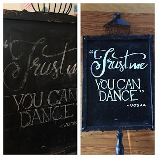
In the above before and after shot, you can see what I mean about sketching out the design, and also observe another benefit of chalk marker: the ink is more opaque and offers better legibility.  This is sort of the corollary to the chalk texture thing I wrote about earlier.  If a painted board has been used and erased multiple times, the chalk finish can begin to wear off.  This creates BAD texture for real chalk, in the form of skipping lines and poor readability.

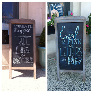
However, in the first photo I posted at the top of this post, you'll see the same board with the same quote written on it.  The board on the left is written in chalk and the board on the right is written with a chalk marker.  The chalk marker board is slightly bolder, and also makes use of some color, which also shows up better with a more opaque ink. That said, I still prefer the notsalgic look of more muted, vintage-looking, regular, old chalk.

Wednesday, August 26, 2015

Baristanet Profile

Happy End-of-August, everyone! I'm on vacation this week, soaking up the last few days of summer with the family, so I hope you'll forgive me for cheating repurposing this week's post. A few months ago, Baristanet featured me as their weekly profile. In it, I talk a little about the beginnings of Stellabird Creative, and as well as some of my favorite things about Montclair, my favorite town in the world (ugh I knooow, I just said that about Cozumel...) It was fun! Like answering those email surveys we used to pass around in 1999 (you remember those...) If you have ever wondered what I listen to while I work or what is on my nightstand, now's your chance to find out! Back to our regularly scheduled programming next week.


Wednesday, August 19, 2015

Four Ways to Use Chalkboards at Your Wedding


As I've mentioned before, I have worked in the wedding industry as a stationery designer for the past eight years.  In that time, I've enjoyed seeing the ways that trends shift and morph in regard to weddings.  In the past couple of years, as resources such as Etsy and Pinterest gained popularity, handmade or repurposed items gained value.  In the wedding world, this translated to a shift toward crafty, rustic, DIY decor.

Furthermore, as once-everyday objects become obsolete, they gain artistic value.  For instance, as maps have been replaced by smartphones and other GPS devices, I've noticed beautiful vintage maps appearing in wedding invitations as custom envelope liners and many couples now have custom maps hand-illustrated to guide guests around the wedding destination.

One of the biggest icons of these DIY/throwback movements has been chalkboards.  Overtaken by markerboards and smartboards in our children's classrooms, we now see chalkboards appearing everywhere from christmas ornaments to wine glasses to high-end clothing stores. In the stationery world, we even see faux-chalkboards printed as greeting cards and notebook covers.

Today, I'm going to share with you four ways in which I've been asked to incorporate custom chalkboards into wedding decor.  The look is trendy and the custom element allows for the overall feel to be tailored to your specific look and feel. And once the big day is over, you're left with a cool board that you can now erase and repurpose!

#1 Bar Menus


This goes hand-in-hand with another wedding trend I love - creating a custom cocktail (or cocktails) for the evening. I love this idea of his and hers drinks.  This could easily be a really cute way to list all the beer and wine selections, as well.

#2 To Offer Guidance


It can be difficult to manage the flow of guests as they arrive, especially since many of the key players are busy preparing for the ceremony are cannot be around to give any guidance.  Leaving your guests notes that look beautiful enough to catch their eye can help to keep them clued in as they try to find a seat, grab a program, AND say hi to friends and family members they haven't seen in forever!

#3 Photobooth Signage


Okay, maybe this is similar to #2 but the photobooth thing is so big right now I felt it deserved its own section.  Again, let your guests know what you expect of them (putting on fire hats and Harry Potter glasses and then being photographed) in a way that catches their attention. Then, proceed to laugh at pictures like this:

Loved ones: sorry I posted this picture of us without your permission.
If you feel your identity is insufficiently obscured we can talk about it.

#4 Ceremony Program


You may remember this one from an earlier post.  A poster-size chalkboard program eliminates all the paper that inevitably ends up scattered around the floor of the venue. Plus its a nice way to catch your guests' eyes as they walk in, offer a welcome, and set the tone for the evening.

Wednesday, August 12, 2015

Java Love Menu Board

Today's story is, in many ways, the story of how I became a chalk lettering artist.  It all starts with this little board right here:

Right here.

I was asked to doodle this board as something to decorate the outside of Paper Boutique in Montclair, where I work as a custom stationery designer.  I have always loved letters and fonts and type so any opportunity I have to write something usually turns into a larger project than it was ever intended to be because I can't help but try to make it beautiful.

One day, our neighbors at Java Love Coffee Roasters inquired as to who had made it, as they had a chalkboard menu at their shop in need of a facelift.

I have always loved the aesthetic of the Upper Montclair coffee shop - the raw woodwork and warm, rustic color scheme appealed to me from the first time I walked in (their countertop is a cool, roughly-painted old door with a piece of glass covering it.  I wish I had a picture to show you).  So I wasn't surprised during my meeting with Jodie when she mentioned wanting to draw inspiration from some of my favorite things - letterpress and the branding on vintage milk bottle caps.  DREAM PROJECT.

So I got to sketching and came up with this rough sketch:

VERY rough.

How they ever looked at that and said "Great! Please come draw that on our walls!" I'll never know, but I'm sure glad they they did.  But I could see the vision in my head, it just didn't translate well onto tiny journal paper.  One thing I'm sure helped is that in the time that it took from signing on to the initial project until we finalized a sketch, I did a number of smaller boards for them, so it was probably a little easier to trust the magic that happens between pencil and chalk.

See?!

The good news is that I have gotten a lot better at the sketching process since then.  Though I will say that my designs for Java Love since then (the hotlists and seasonal wall designs) have not been sketched for more than a few minutes right before I put them up. I swear there is an abundance of creative energy in that place from all the caffeinated creation that happens there all day because it really just flows.  Even on the night that I put up the menu board, the process took over and it ended up even a little different than how I originally planned:


Believe it or not, that part at the top accounted for about 50% of the time I spent working on the board.  I really wanted it to be a perfect focal point.  The rest of it was just filling in words and numbers.


Before.
After.


Wednesday, August 5, 2015

Inspiration Post: Cozumel #tbt

Okay, so I'm a little late with the post this week - so I've decided to make it a joint Inspiration Post AND Throwback Thursday post.

Back in April, my boyfriend, Dan, and I went on vacation in Mexico.  We spent a few days in Playa del Carmen at a friend's wedding, before hopping across the Caribbean Sea to a tiny island called Cozumel.  

Photo Credit: Google Maps

It's a beautiful little island, known mostly for the spectacular snorkeling and scuba diving opportunities - as the waters are clear and the coral reefs and wildlife are really remarkable.


We did our fair share of snorkeling and chillin' out maxin', relaxin' all cool by the pool, but our favorite part of the trip was our morning journeys into town.  Once one wanders beyond the coastal roads, lined with tourist shops and all-inclusive resorts, a hip little world of hostels and scuba divers opens up.  We spent every morning at a tiny little coffee shop which felt very much to us like the Mexico version of Java Love - filled with regulars or transient scuba enthusiasts (we were the only ones wearing resort wristbands, I'll tell you that much.)

Once we were sufficiently caffeinated, we would spend a couple of hours walking around the town. This was always my favorite part of the day, and you'll soon see why...

Every.


Sign.


In Cozumel.


Is hand-painted.


There are barely words to describe how excited I was about this. Dan was such a good sport, waiting patiently every half block as I looked like this:


The craftsmanship was really remarkable.  I particularly loved seeing some of the signage painted on eye-level walls, as the rules and pencil sketches were often still visible - plus it was cool to see the brushwork up close.  Those casuals!!


The painted letters really added an element of artistry and simplicity to the overall ambience of the town.  Everything from advertisements to business entrances were beautiful and original.

Everything from advertisements...
...to business entrances.
So basically my life plan is now to paint letters in paradise permanently some day.  If you ever have the opportunity to visit Cozumel, I suggest you take it.  Before we left we were already planning our trip back.  Life is beautiful, quiet, and simple here.

And when you go, eat here - a restaurant called La Choza. Trust me.

Wednesday, July 29, 2015

Acclivity Chalk Mural 3 of 3: Core Values Wall


When I was initially approached about the Acclivity project, we were only thinking of doing one board (the Welcome wall) and hadn't yet decided what to fill it with.  I started poking around their website to get a feel for what they were all about and came across their Core Values. That's when I became sure that they were first of all, cool, and second of all, a great company to work with as well as for.  

Their number one value states that “We are what our customers say we are” and that is obviously at the heart of their work. But values like “Be Yourself” and “Wash your Dish” give such insight into the way the team works as the sum of its highly-valued parts. I immediately thought it would make for an interesting board so was so excited when Scott brought it up later, as we got deeper into the project.


I kept the header in the theme of the other boards, and challenged myself to come up with unique layouts for each of the ten values. I initially wanted to keep the marquee bulbs around each of the tiles but I decided it might distract from the header and typography (also I realized it would take five thousand hours to make all those little circles).